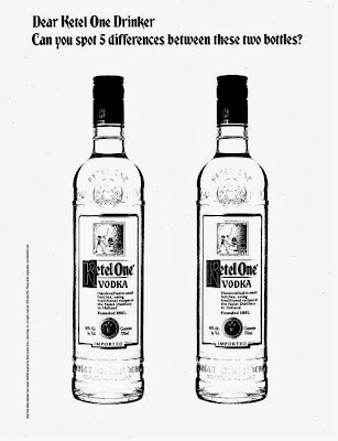
i saw this ketel one ad smack in the middle of wired, and found myself spending time with it. after about a minute, i realized i had been duped - but as an advertising professional, i was okay with that.
you see, there aren't any differences between the two ketel one bottles. but, you sure have spent a hell of a lot of time staring at them!
good work.

_

No comments:
Post a Comment